The Hidden Detail on the Starbucks Logo You Never Noticed Before


Updated: Apr. 25, 2024
There's one small imperfection on the iconic Starbucks logo—if you look closely, can you catch it?
Whether you’re an at-home coffee drinker or an avid coffee picker-upper on the way to work, you’ve no doubt by now tried something from Starbucks.
Maybe it’s the scent of freshly brewed beans that beckons us in, or maybe it’s the mystical maiden on that iconic green Starbucks logo. That wavy-haired woman, after all, is part of the magic that brings us our ever-favorite pumpkin spice lattes, summery Starbucks Refreshers and classic Pike Place brew.
The History of the Starbucks Logo
While there are many secret messages in company logos you may not know about it, there was one last-minute change to the Starbucks logo redesign in 2011 that made all the difference according to the team that designed it.
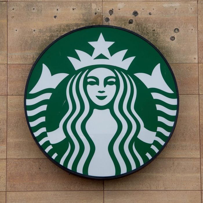
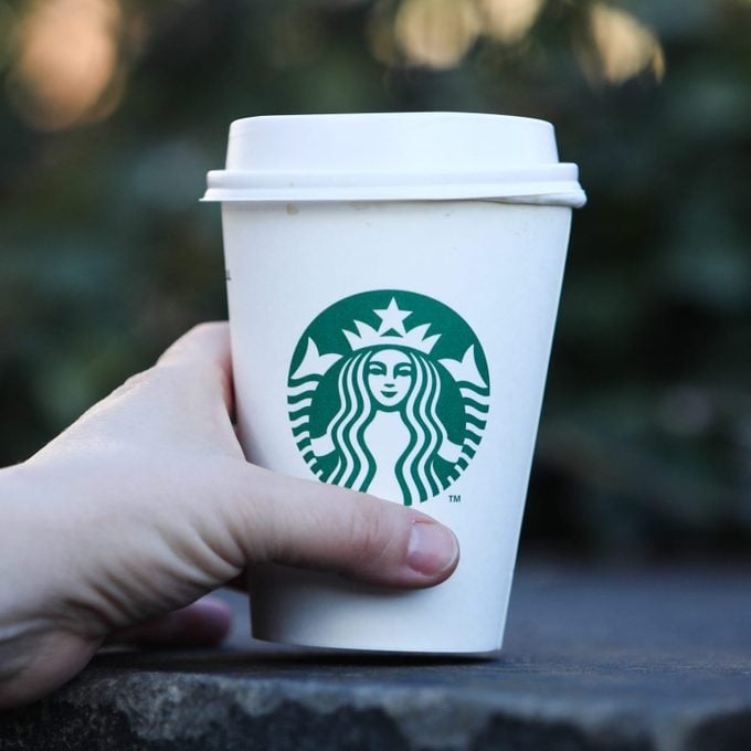
![]()
That memorable mermaid gracing all your Starbucks cups is a mythological siren. If you’ve ever read Herman Melville’s Moby Dick, or at least heard of it, you probably know that the Starbucks name comes from this novel.
Sticking with the seafaring theme, the now-iconic logo came from scouring old marine books. Seeing that coffee beans travel overseas in large ships and the original Starbucks location is in the port city of Seattle, the siren was perfectly fitting.
The logo has changed over time. In 1987, the color went from brown to green, and then the logo design got a modern makeover in 1992 when Starbucks became a publicly traded company. It was the redesign in 2011, though, that brought about the small but very significant change that we know and love today.
In 2011, the Starbucks siren had some work done on her face, and her hair was smoothed out a bit. And now that she was so recognizable, the words “Starbucks Coffee” were taken off the logo. However, nothing about this siren was perfected, per se.
The Hidden Detail in the Starbucks Logo
During this logo makeover, her imperfections were brushed away, and her face became more symmetrical. But, after several attempts, the team thought something was still off. “As a team, we were like, ‘There’s something not working here, what is it?;” Global Creative Director Connie Birdsall told Co.Design. “It was like, ‘Oh, we need to step back and put some of that humanity back in.’ The imperfection was important to making her really successful as a mark.”
Upon first glance, you might not notice it, but there is a slight asymmetry in the siren’s face. The next time you grab a latte, take a long look. You might notice that the right side of her face is more shaded than the left side: Her nose dips slightly lower on the right than the left and her right eye is caught in the shadow from the bridge of her nose. “It felt a bit more human and felt less like a perfectly cut mask,” design partner Bogdan Geana said.
After all this talk of the classic green logo, you might be craving some of your Starbucks favorites. The next time you pick up a Starbucks breakfast or your go-to Frappuccino, check out the logo for yourself. Can’t get to a Starbucks right now? Here are some of our favorite copycat menu items to make at home.