How Should A Workplace Safety Sign Look?
Rochelle Williams, ASP 👷🏾♀️
I keep the workforce SAFE and HEALTHY by: Identifying and controlling hazards and improving systems to prevent negative outcomes. HSE Supervisor~ Public Speaker ~HSE Trainer ~Friend
I went on a site visit recently and saw some 'safety signs' posted on the property but something about them was odd. They stood out more than the usual to me and not for favorable reasons either. The signs were displaying pictures and had text warning of a workplace hazard but they were not the standard layout of a general workplace safety sign. The person responsible for putting up these signs had good intentions in wanting to inform persons of the potential hazards but missed out on them been standard/universally recognised.
A safety sign should be universal with the following basic layout and features:
1.A header or signal word: CAUTION, DANGER, NOTICE. This indicates the risk level of the hazard at the top of the sign.
2. A hazard statement: High Voltage Area. Keep out. Authorized Personnel Only This describes the hazard type, the consequences if information is not heeded, and how to avoid the hazard.
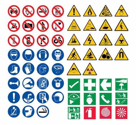
3. A pictogram or symbol: Can be either: Hazard Alerting, Mandatory action, Prohibition or Informational. These helps to communicate the hazard even with language barrier.
4. Follow a particular color scheme: Red is usually depicts danger or fire equipment , Yellow is usually for caution, Orange is usually for warning etc.
ANSI safety signs are in a slightly different format than OSHA signs, however, ANSI signs are still compliant with OSHA because in 2017 OSHA adopted the ANSI Z535-2011 standard for use in safety signs. Below is a depiction of the changes.

Image taken from: Safetysign.com 8/11/21
While we all are keeping our workplaces as safe as possible let us strive to maintain standard safety signs that are globally accepted to maintain unison. Until next time keep safe guys :-).
- RW Safety