The Starbucks logo is an emblem that has come to be recognized across the globe. It’s much more than just a symbol of one of the world’s largest coffee chains; it’s a piece of branding that evokes a sense of community and connection to millions of coffee lovers. In this blog post, we’ll explore the fascinating history of Starbucks’ logo and how it has evolved over the years.
The Birth of the Brand
Founded in 1971 in Seattle, Washington, Starbucks initially sold only whole coffee beans and tea, not the ready-to-drink beverages we associate with the brand today. The old Starbucks logo, or the original Starbucks logo, was designed to represent the maritime history of the city and the seafaring tradition of coffee transportation.
The Original Logo: The Bare-Breasted Mermaid
The original Starbucks logo featured a two-tailed mermaid or siren from Greek mythology. The image was inspired by an old sixteenth-century Norse woodcut, a symbol that resonated with the maritime theme. The first version of the logo was a complex, detailed image that showed the siren in full, with a prominent display of her two tails.
The 1987 Redesign: The Beginnings of Modernization
When Howard Schultz purchased Starbucks in 1987, he sought to redesign the brand to align more closely with a new vision for the coffee house experience. The original logo was simplified, and the siren was cropped to include just the tails above her waist, and the color palette was changed to green, reflecting growth, freshness, and uniqueness.
The 1992 Redesign: Further Simplification
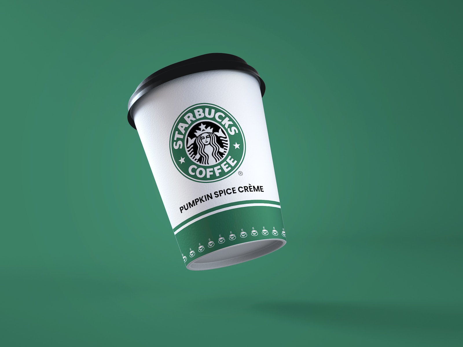
In 1992, as Starbucks prepared to go public, the logo was redesigned again to make it more suitable for various applications. The design was further simplified, with the siren’s navel and breasts removed from the image, and the “Starbucks Coffee” text was added to the circular frame.
The 2011 Redesign: Honoring the Siren
On Starbucks’ 40th anniversary, the company unveiled a new logo that removed the outer ring and the words “Starbucks Coffee,” leaving only the siren in a green circle. This change was meant to represent Starbucks’ transition from a coffee-centric identity to a more diversified beverage and food company. The siren had become the essence of the brand, and the minimalist design put her at the center.
Conclusion: The Starbucks Logo as a Symbol of Connection
The original Starbucks logo history reflects the company’s evolution from a small coffee shop in Seattle to a global phenomenon. Each redesign has aimed to modernize the image while keeping the core symbolism intact.
The siren is more than just a figure from mythology; she symbolizes the connection that Starbucks aims to create with its customers and the broader community. The Starbucks logo meaning is a beacon for those seeking a place of warmth, community, and of course, a great cup of coffee.
It’s fascinating to observe how the old Starbucks logo can evolve to encapsulate the values and aspirations of one of the world’s most influential brands. The Starbucks logo, in its elegance and simplicity, will likely continue to be a symbol that resonates with millions of people for years to come.
For more on our logo series, check out the blog about Pampers, and if you’re interested in the beverage industry, you’ll need to read about the brands PepsiCo owns, green drinks, and the Prime Drink brand.